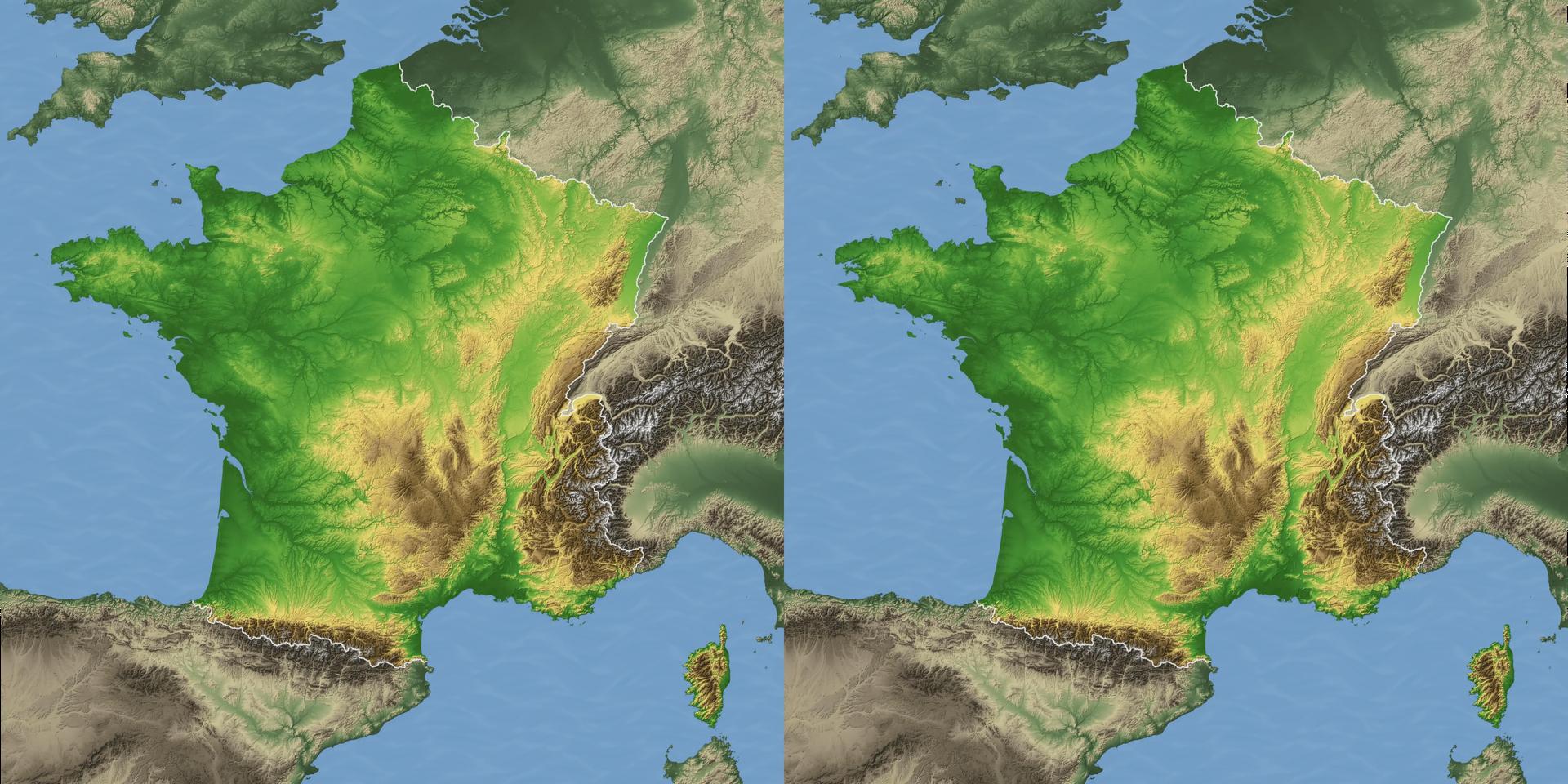

Elevation of France
by JackDesBwa 2021-04-16 08:55
This image represents the elevation of France. It is limited to its metropolitan part because I was discouraged by the amount of work to add the overseas lands. The height is at free scale.
I did not write the whole procedure, but I can mix some notes and memory to summarize it.
The input data are based on GADM for the administrative limits and elevation map with a resolution of 3 arc second from the "viewfinder panoramas" project for the height.
I first transformed the data into images using a combination of the tools of the gdal software suite to assemble the different tiles, convert to images, project in the coordinate system that I wanted, and so on.
I exported 4 maps:
- an administrative outline of the country
- a color-relief map with a custom palette, i.e. I chose a color for each altitude
- a hillshade map, which shows only the shadows of the hills as if the scene was lighted on the top-left corner
- an elevation map in levels of grey
Then I imported all the maps in Gimp and started to merge them.
The base map was the colored one enhanced by the shadows. The administrative limits helped to have a nice white outline and to lower saturation for the rest of Europe. The seas were also added manually, but the shore was difficult to get right because of several factors such as lands under the sea level or near it on some coasts.
The 3D part was made with an horizontal displacement based on the elevation map. I also manually removed some weird artifacts, added some texture in the sea areas, and removed window violations on the edges with a window following the elevation thanks to the depth map.
I think the result is pretty cool. I particularly like to zoom in the image and look at the details, like in the zones of high relief or the beds dug by the rivers.
-- 2020-06-13, computer generated

Comments
JackDesBwa 2021-04-18 09:19
Actually I wanted to exaggerate the depth so that it can be perceived when the image is viewed in its entirety, but not too much so that it does not look completely crazy when explored at 1:1 pixel scale. The compromise is not easy: the overall picture has quite shallow depth, but when zoomed it looks already overemphasized.
PaTh2018 2021-04-16 22:16
This is for a big TV or Beamer. Thx Jack.