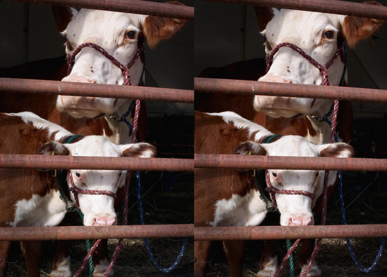

Cow Eyes 2020 (re-edit)
by Phostructor 2020-08-24 15:35
This is a significant re-edit of an image I have long considered one of my best. Through the magic of Photoshop I eliminated some distractions in the background. I cropped more tightly, bumped the contrast and adjusted the color to be more neutral. I cannot completely eliminate a line up the left side when viewed in anaglyph, but I am mainly a parallel viewer and it looks more better that way.
Is there an intrinsic rivalry because of the diagonal tilt of the bar in the foreground?
Shot with a pair of Canon 50D with 28mm lenses.

Comments
JackDesBwa 2020-08-28 15:00
The line on the left is here because your two views are not of the same size. The viewer cuts the provided parallel version in half, and thus 0.33% of the left image is included in the right image here.
I find the overall details in the picture better (except for remaining black dots over the head), but cropping more tightly make the image less interesting in my opinion. The horizontal lines guide the gaze outside of the photograph, but if I remember well, in the other version you had a few elements (bolt, spiderweb, longe) that created a path to naturally return inside the image that are not here anymore.